Work & Responsibilities
- User Experience Design
- User & Market Research
- User Interface Design
- Low/Hi-Fidelity Wireframes & Mockups
- Interactive Prototypes
- Iterative Usability Testing
- Web Development
Industry
- Higher Education
Project Brief:
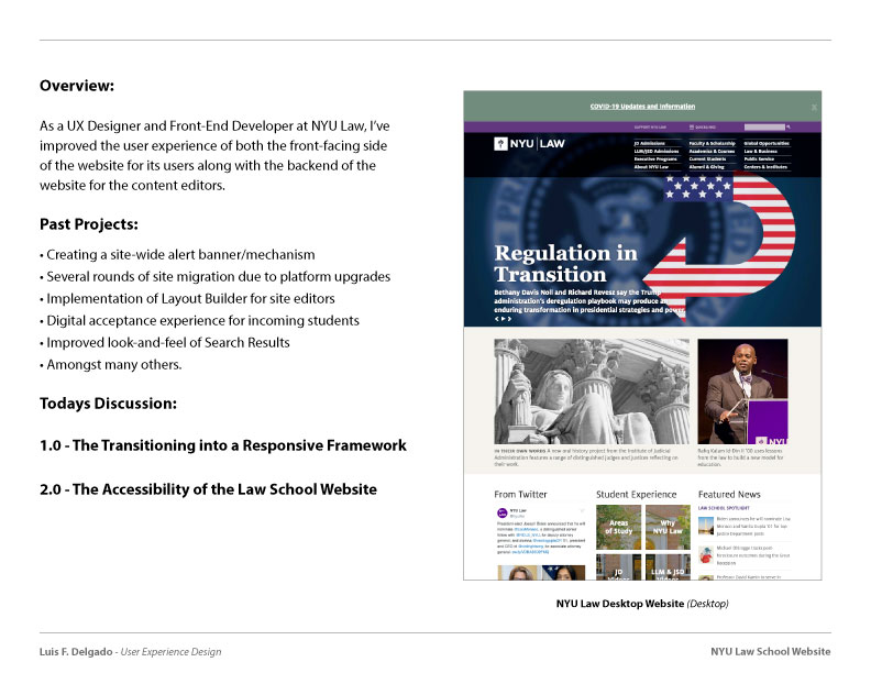
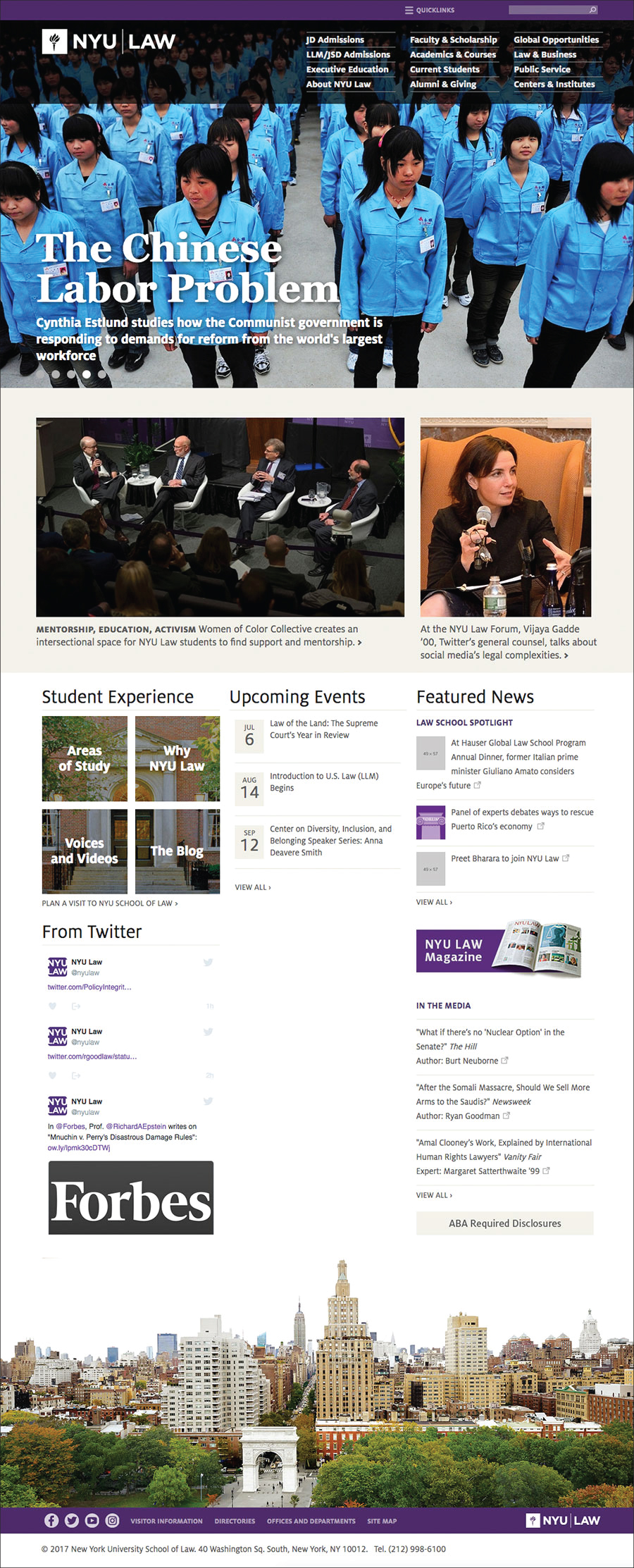
During my time as a user experience designer and front-end developer at NYU’s Law School, I worked alongside designers, developers, and project mangers to improve the school’s digital presence by building and maintaining accessible products that effectively meet the needs of diverse users at the University.
Along with the daily production of digital products, my duties also include maintaining the Law School’s central web presence and managing different initiative-based and departmental websites across the University using various web-related technologies such as HTML5, CSS3, PHP, Javascript/jQuery, Drupal, and WordPress.
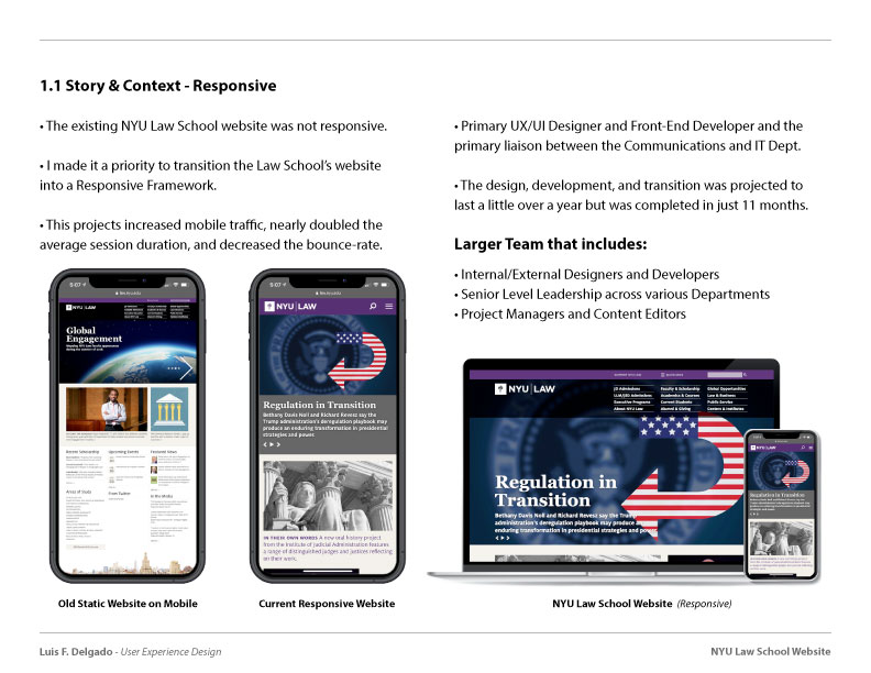
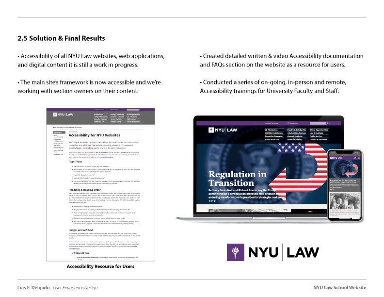
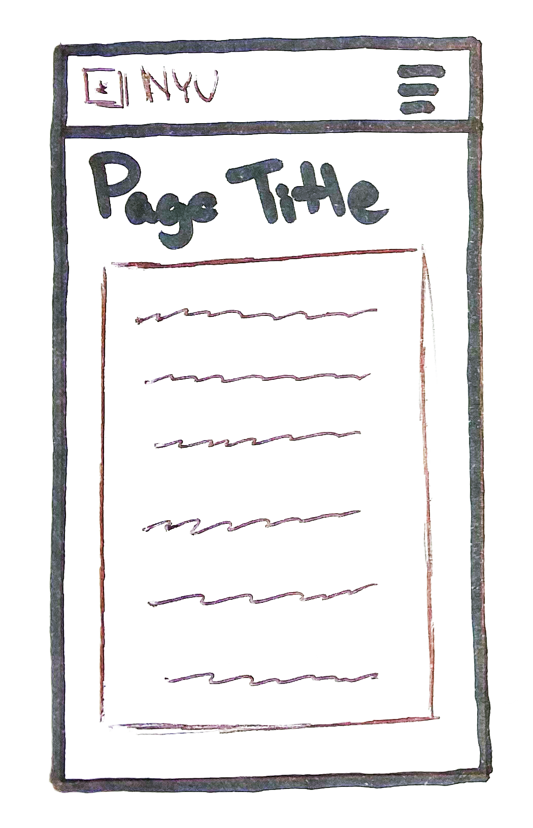
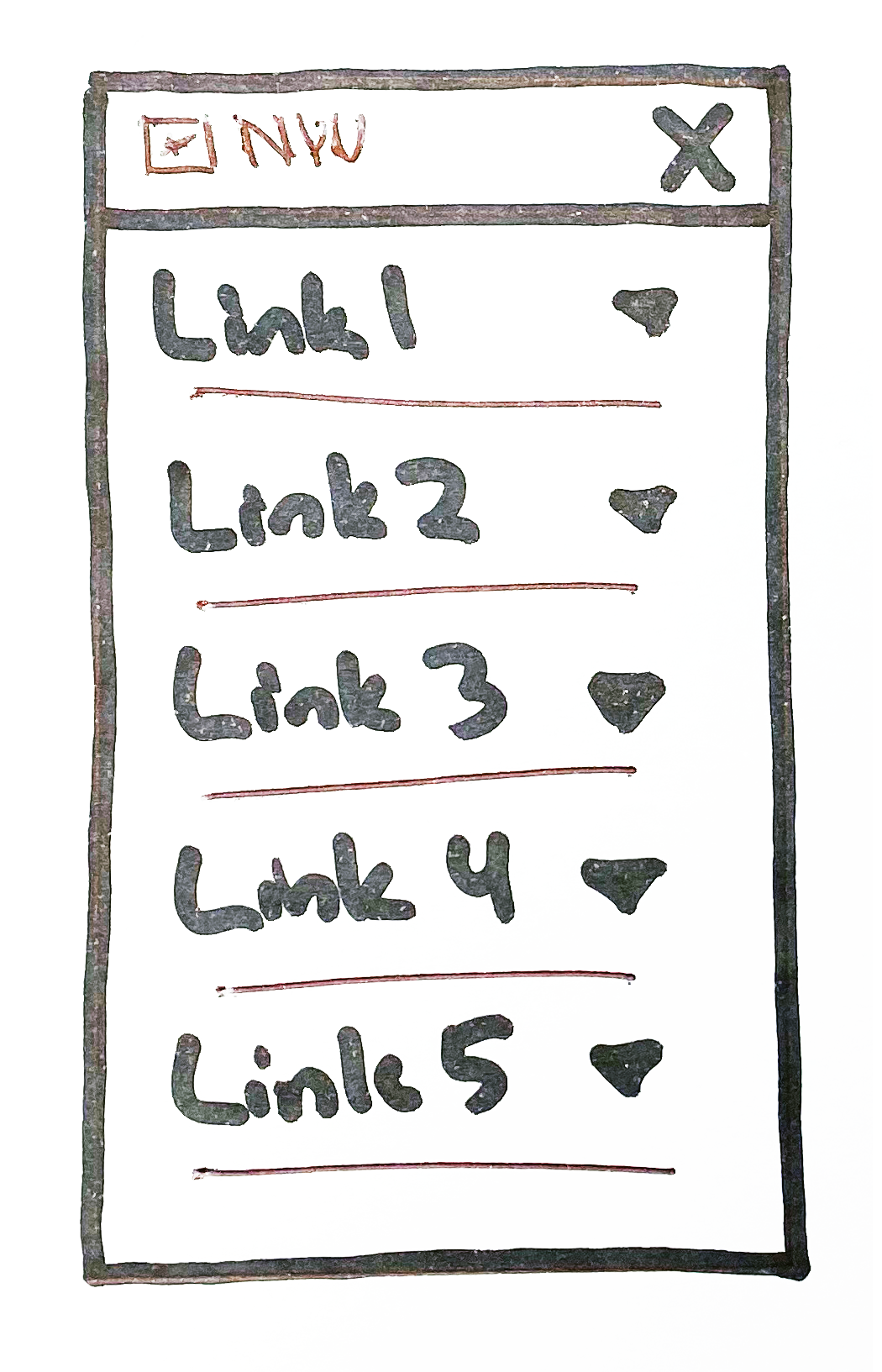
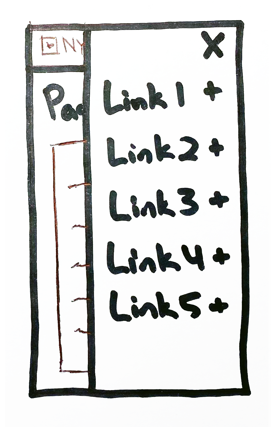
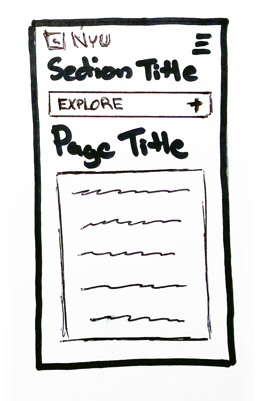
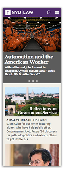
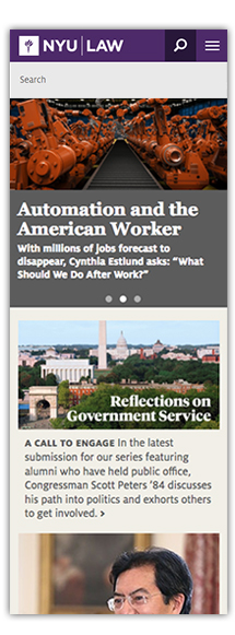
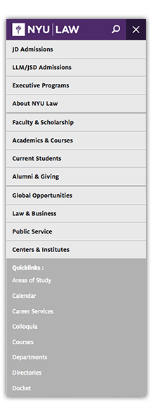
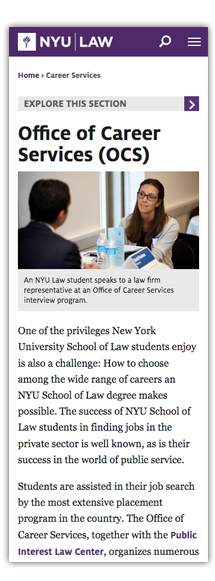
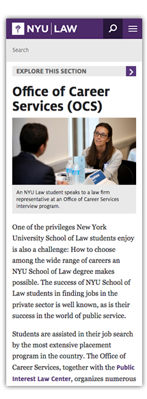
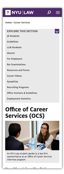
I served as the primary Designer in the efforts to transition the old static website into a new responsive framework by designing the global and local mobile navigation templates that are currently in use on the Law School’s website.
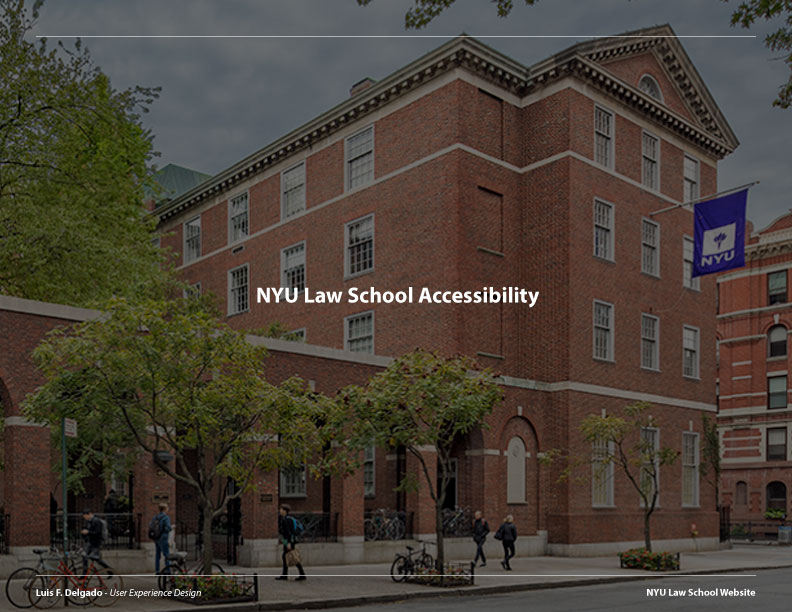
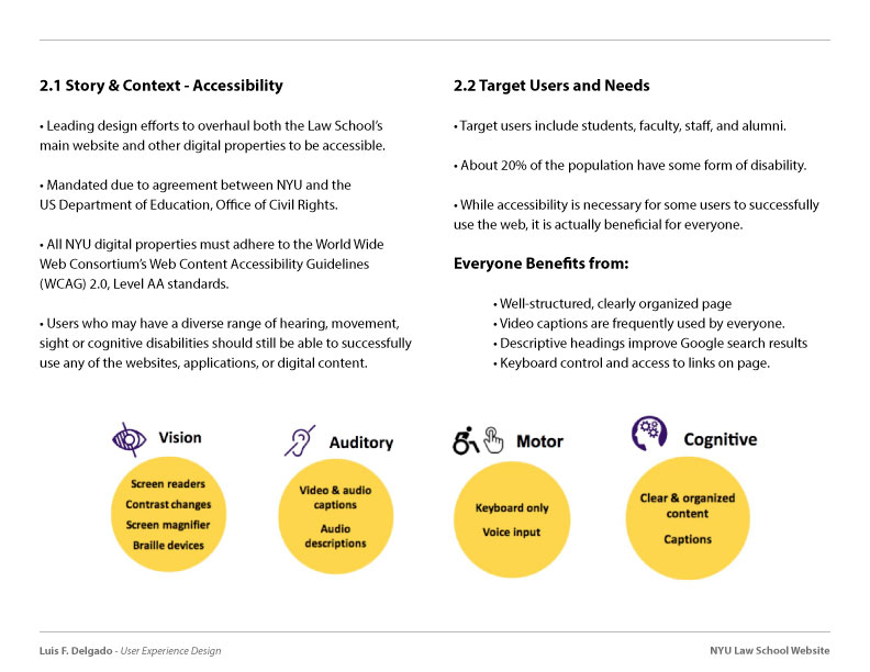
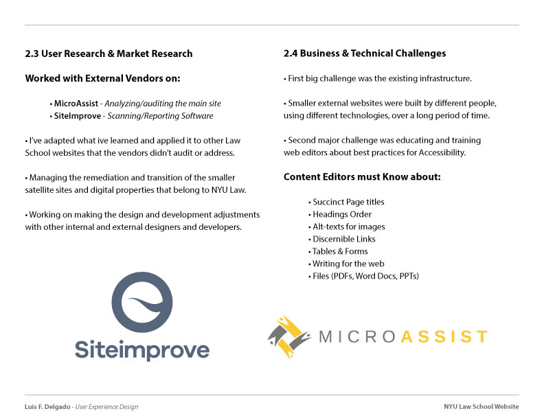
I’m also lead the Design efforts to modify the Law School’s website to meet the WCAG 2.0 Accessibility standards, ensuring all users, including those with disabilities, are able to successfully use the website.
Target Users:
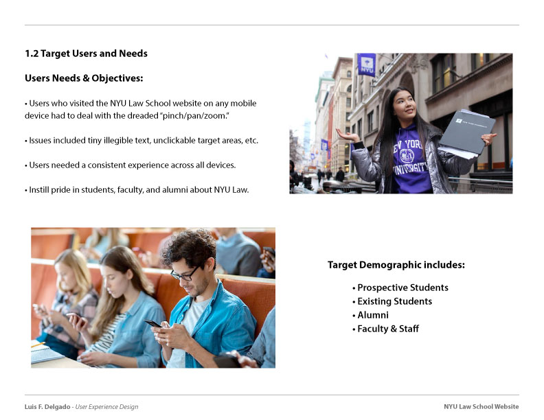
The target users for this project included a very large and diverse demographic that for the most part included Prospective Students, Existing Students, Faculty, Staff, and Alumni.
Needs & Objectives:
Well into the age of smartphones, users who used the website on any mobile device were subject to the awful pinch/pan/zoom from ages ago. Users had to deal with tiny illegible text, unusable menus/links, broken page-layouts amongst many other issues. Users not only needed, but really at that point deserved, a consistent/seamless experience across devices when visiting the website of the University they were paying so much for to attend.
User & Market Research:
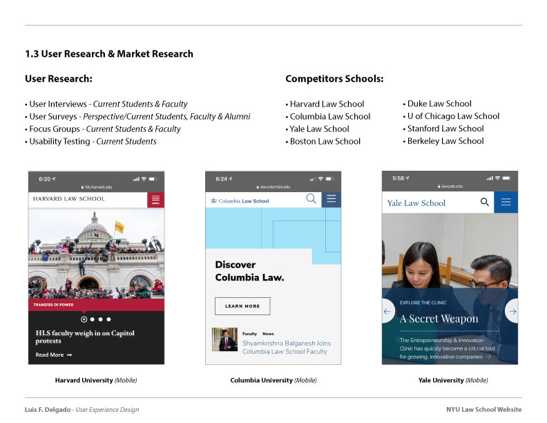
We conducted a series of User Interviews, Surveys, and Focus Groups with students/faculty to identify any other weaknesses in the website outside from making it mobile friendly. The users played a more vital role down the line when we conducted usability testing of different navigational structures and behaviors in order to find the most effective approach.
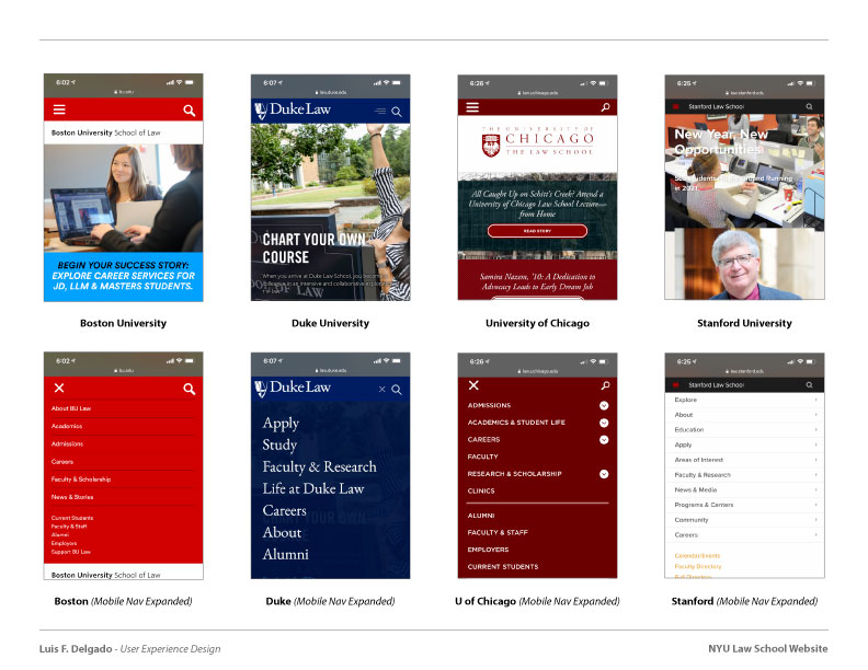
Though the need for mobile friendly experience was evident, I still made it a point to dive deep on market research as to how other University’s were handing their responsive layouts and global vs local navigation on their websites. Some of the schools we looked at were Harvard, Columbia, Yale, Duke, Stanford, Berkeley and many others.
Business & Technical Issues:
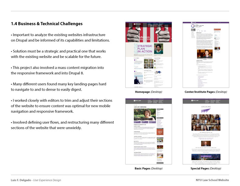
It was important to analyze the existing websites infrastructure on Drupal and be informed of its capabilities and limitations. It was vital to design a strategic/practical solution that lends itself to work with all of the different existing menus, content-types and sections on the website, and be scalable for the future.
From our user research, we learned that many different students found many key landing-pages hard to navigate too and to dense to easily digest. So I worked closely with different editors and section owners to trim and adjust their parts of the website to ensure it would fit the new mobile nav and responsive framework we were implementing. This involved defining user flows that had never been defined, and restructuring sections of the website that had grown unwieldy over the years.
Solution Proposal:
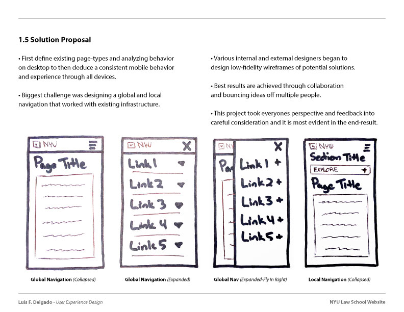
After defining the content-types and page variants and analyzing their behavior on desktop, a mobile behavior was deduced that would ensure a consistent reading order and experience on all devices, desktop down through mobile. The biggest challenge by far was designing a global and local navigation that was optimal throughout the entire website and all its different sections.
So after collectively brainstorming, a few other designers as well as myself, began to develop low-fidelity wireframes of various potential navigation approaches.
Usability Testing:
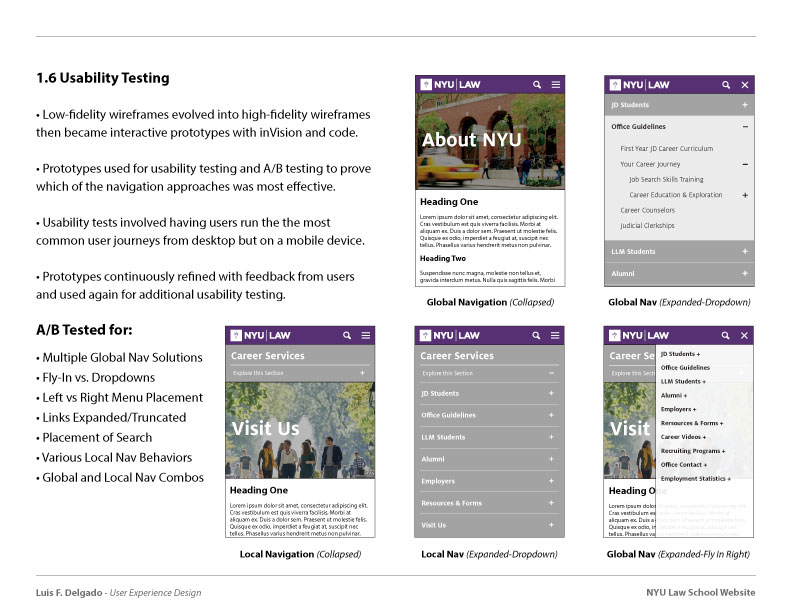
With time, these low-fidelity wireframes slowly began to mature and evolved into more detailed high-fidelity wireframes then eventually interactive prototypes, some with inVision than later live code. We took those prototypes and conducted a series of usability tests and A/B tests to prove which of the proposed navigation behaviors was most effective for users.
This involved outlining some of the most common user journeys for the website on desktop, and have users do the same but on a mobile device. Some of the things we A/B Tested for were fly-in menus vs dropdown menus, placement of the menu icon, and the link in menus being expanded vs truncated. These prototypes were then further refined accordingly to the feedback from the different users and once again, placed back in front of users for more usability testing ensuring the users needs were indeed being effectively met.
Final Results & Outcome:
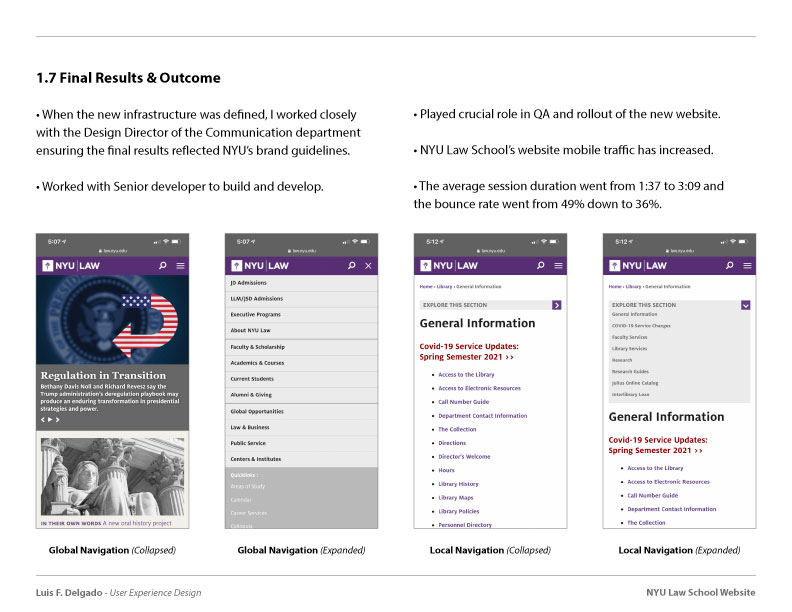
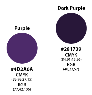
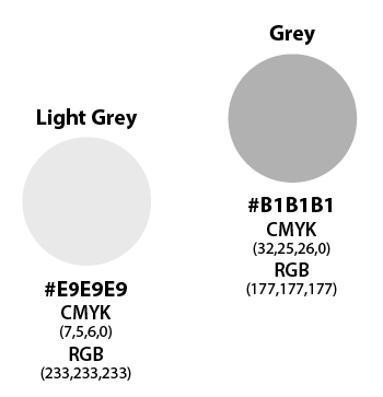
Once the structure and behavior was finalized, I work closely with the Design Director of the Communication department in making many of the final design decisions ensuring the end-results reflect the visual design language and brand guidelines of NYU. I then worked closely with the Senior developer on my team to help develop and QA the rollout of the new website.

